
[ SOME OF MY RECENT PROJECTS ]


I created these posters at a time where I felt a lot of emotions. What better way to express your thoughts and emotions than staying up until 2 in the morning on a Tuesday, letting your fingers design until you get too tired? As a 20 somethin’ year old, we have a lot of feelings about our feelings because the world is our oyster during this life phase. But that really means that we have so many avenues to take, so many options, but also so many questions. In the end, we realize we can do it and that the sun will rise in the morning.
MORE(!!!) POSTER/GRAPHIC DESIGN WORK

LIFE IMITATES ART
Four words: midcentury modern interior design. I have been head over heels in love and inspired by all things midcentury modern design. So, naturally I designed a couple of posters that reflected that inspiration and creativity.
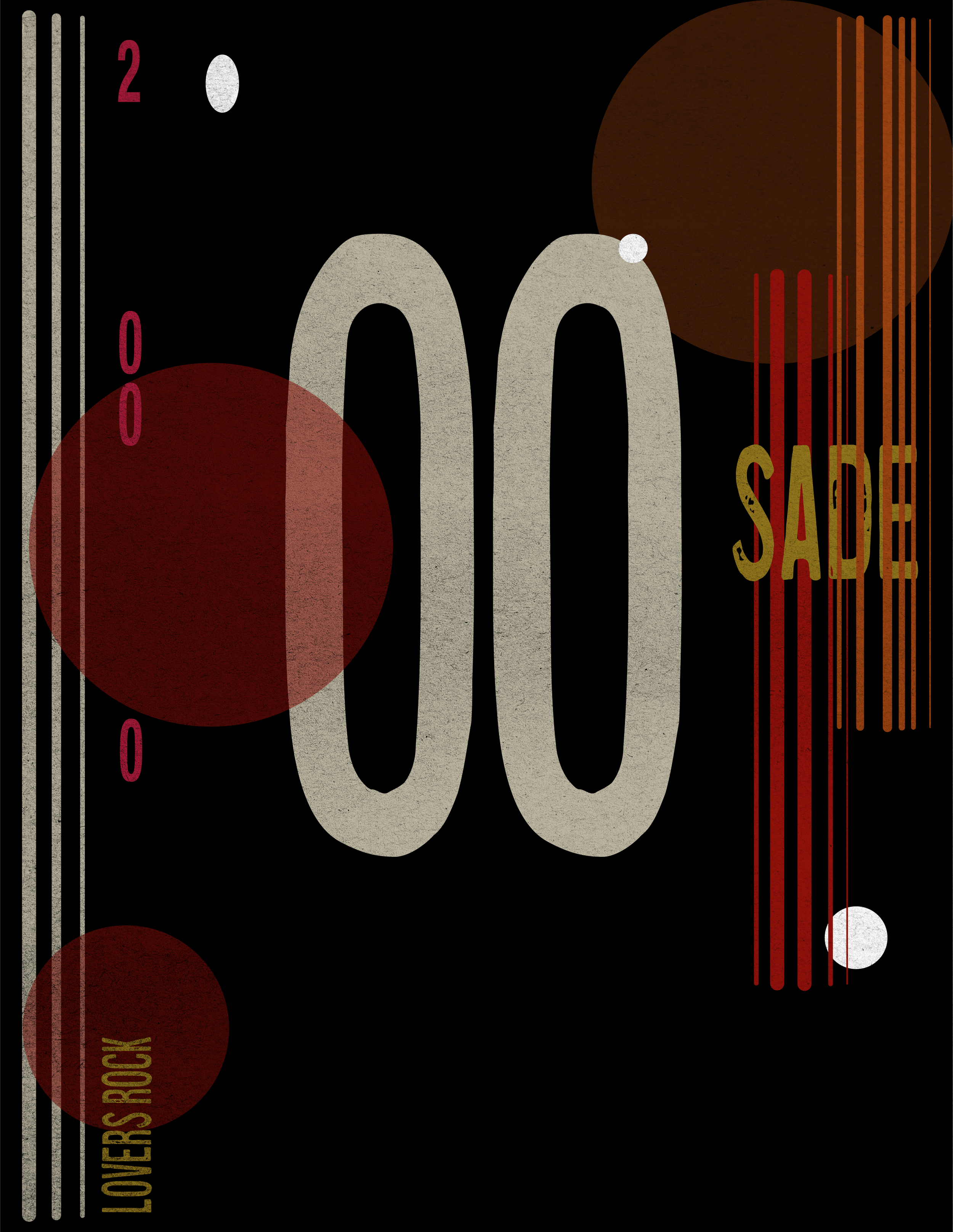
THE RESULTS:
There were a few key details I wanted to pull from my Pinterest-binge of research. Intentional pops of color (like cobalt blue), moodiness, a bit of jazz inspiration and geometric (and organic) shapes. With those elements in mind, I created two juxtaposing posters that still look like they belong in a midcentury modern-inspired office, or living room, or even a bathroom. In fact, these two posters are currently hanging in my room.
KF AUTO DETAILING • LOGO DESIGN
If you can’t already tell, cobalt blue and I are quite inseperable. This logo design was for a local auto detailing business.
The key for this logo design was to design something sleek and simple, while still standing out in a market of loud car detailing logos. The typeface was chosen because the client wanted something that fit the clean, mechanical feel of the service offered, while playing homage to the word “king.” I chose a typeface that both resembled that of a deck of cards and embodied simplicity and a mechanical nature.
