MAMS
MALTS
Concept work - Product and Graphic Design
Skills Applied: Brand Identity Design · Logo Creation · Packaging Design · Product Mockups · Visual Consistency · Typography · Color Theory
[ THE CHALLENGE ]
The infamous parking lot taco business, known for their fresh tortillas and Tijuana-style tacos, wanted a new look. They wanted to maintain their traditional essence, but were looking for a modern twist.
[ THE RESULT ]
I developed a complete brand identity system for a conceptual snack company, including logo design, color palette, typography, and packaging mockups. The goal was to create a cohesive, shelf-ready brand that communicates clarity, confidence, and originality. The brand was inspired by the emperor gum moth, with the product being an edible candy partially made with the actual insect as an ingredient.
This project demonstrates my ability to build a brand from the ground up, combining design strategy with visual consistency across print and digital applications. Every design decision, from type hierarchy to packaging layout, was made with the end consumer and retail environment in mind.
[ MY ROLE ]
Lead graphic designer
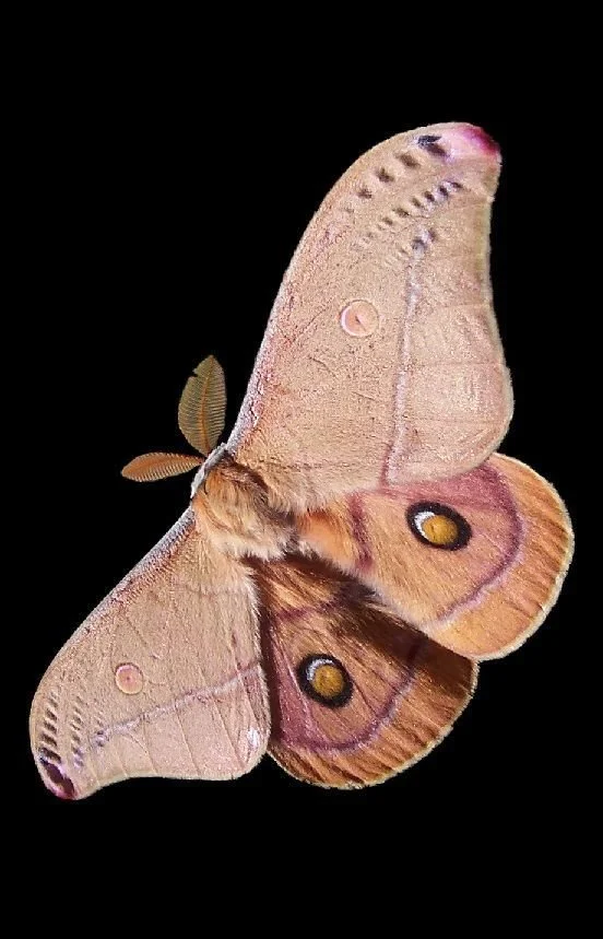
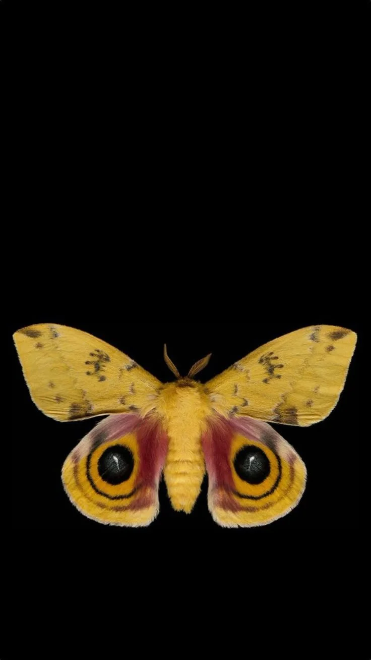
The most exciting part of this design process was choosing the insect my brand and product would be based on. At the time, I was completely drawn to moths. I came across the Emperor Gum moth, you know, the one with the large black dots on its wings. I was immediately captivated by both the discomfort and beauty of the moth’s most famous feature. I knew I wanted to incorporate both its wings and the dots in my design.
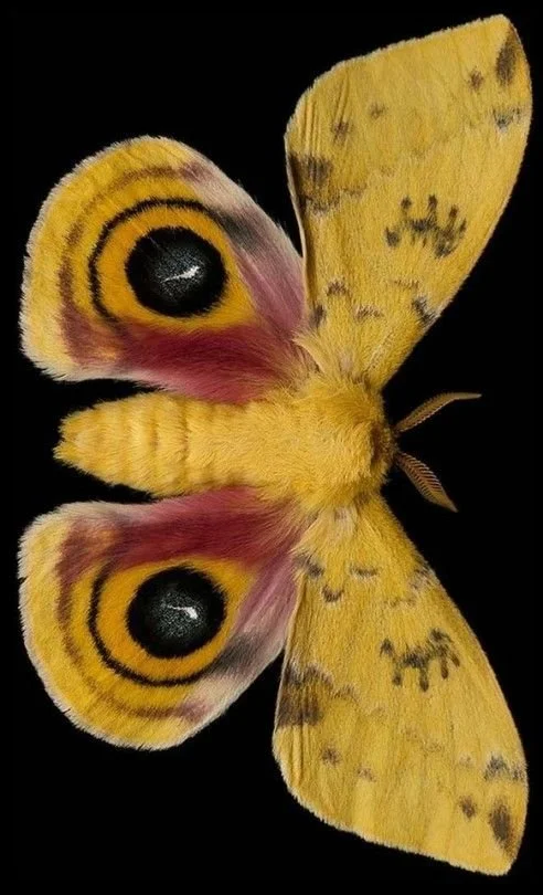
creamnosugar on Pinterest.com
My creative process for this project began with research. This helped me gather preliminary ideas, possible brand names, inspiration, and sketches that helped invoke creativity. From my research, I was able to learn about the insect in depth, including its scientific name, the root word of the insect name, etc. This ultimately helped me come up with not only a creative brand, but one that would be easily digestable for consumers.
Here is how I thought about it: its scientific name is Opodipthera Eucalypti. When pulling the “Opo” from the first word, I was able to plug in the “mm” sound and the letter ‘M’ in Emperor Gum Moth. I mashed the two together. creating the word “Opums.”
KEY WORD: OPUMS
Opums turned to mums, then to malms, and finally mams.
This is where “malts” comes in. Mams Malts just rolls off the tongue, and it made it easier to decide on my product: malts!
My Creative Process:
( how my brain works)

[ Phase 1 ]
[ Phase 2 ]
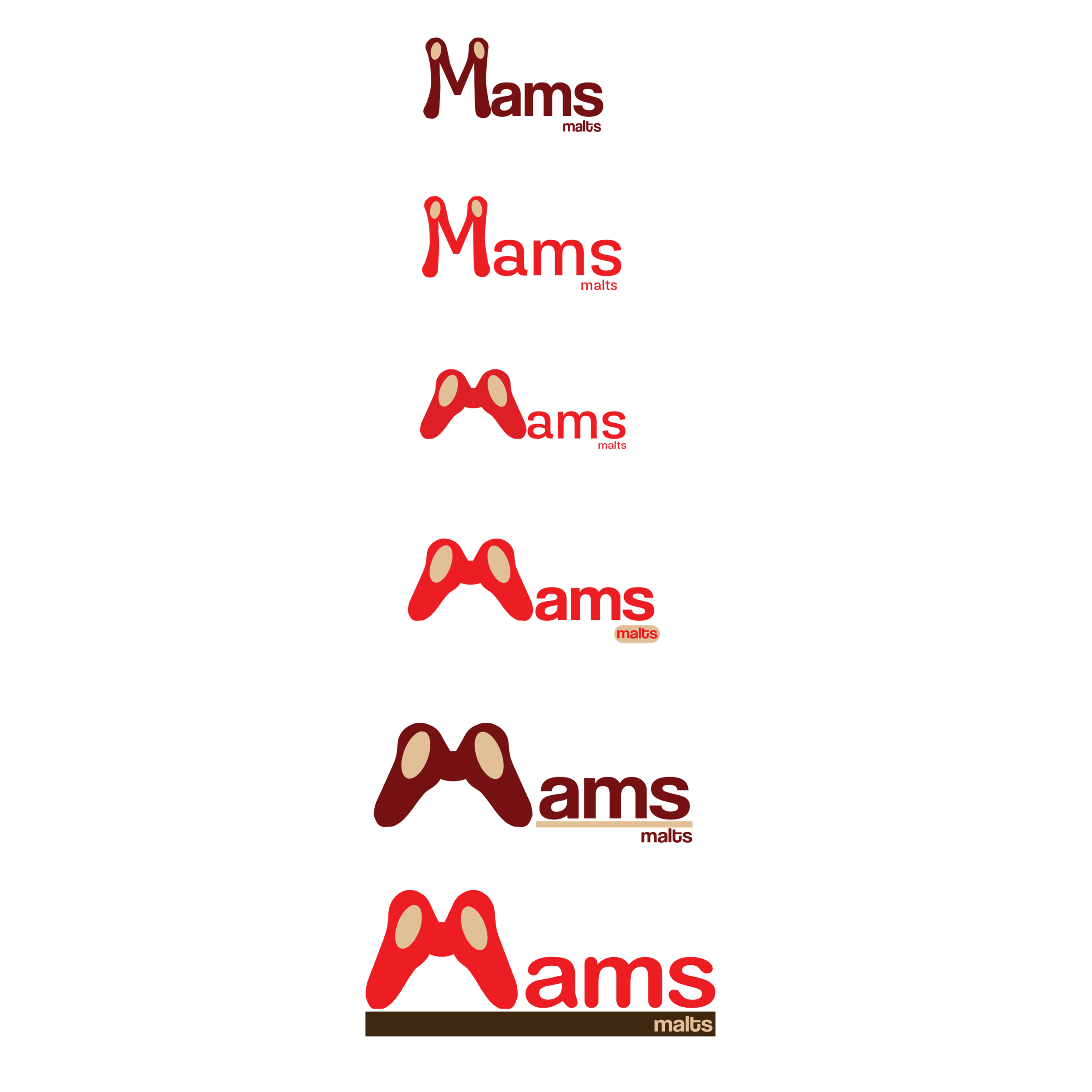
One of the main challenges I faced was thinking outside the box. I knew I wanted to incorporate moth wings in some way that wasn’t so obvious, but enough to where you didn’t need to think too hard about it. There were so many ways to casually and obviously use moth wings in my logo. But, my ultimate solution and design choice was to blend the letter “M” with the Emperor Gum Moth’s wings — again, in a way that wasn’t so obvious but didn’t require consumers to dissect the logo too much. In my sketches, you’ll see that I played around with a lot of ideas regarding how to incorporate the moth wings within the logo.

In the early phase of conception, I was working through the idea of using the letter M to represent moth wings. I began to add organic curves to resemble wings and tested different color palettes to experiment with the tone of the logo.
In the next phase, I created an entirely organic motif that resembled wings in a more fun and clear way. Pulling inspiration from the emperor gum moth, I added the two ovals to the M because it was a key element I knew I wanted to implement in the final design.
In phase 3, I continued experimenting with bringing distinction to “Mams” and “malts” so I played with the idea of using a bar to separate the two words as I felt that the negative space within the two words was not working.
In the final version of the logo, I cleaned up the letter M, switched the typeface of “Mams” to a more playful one that tied into the organic nature of the letter “M,” and finalized the placement and design of “malts.”
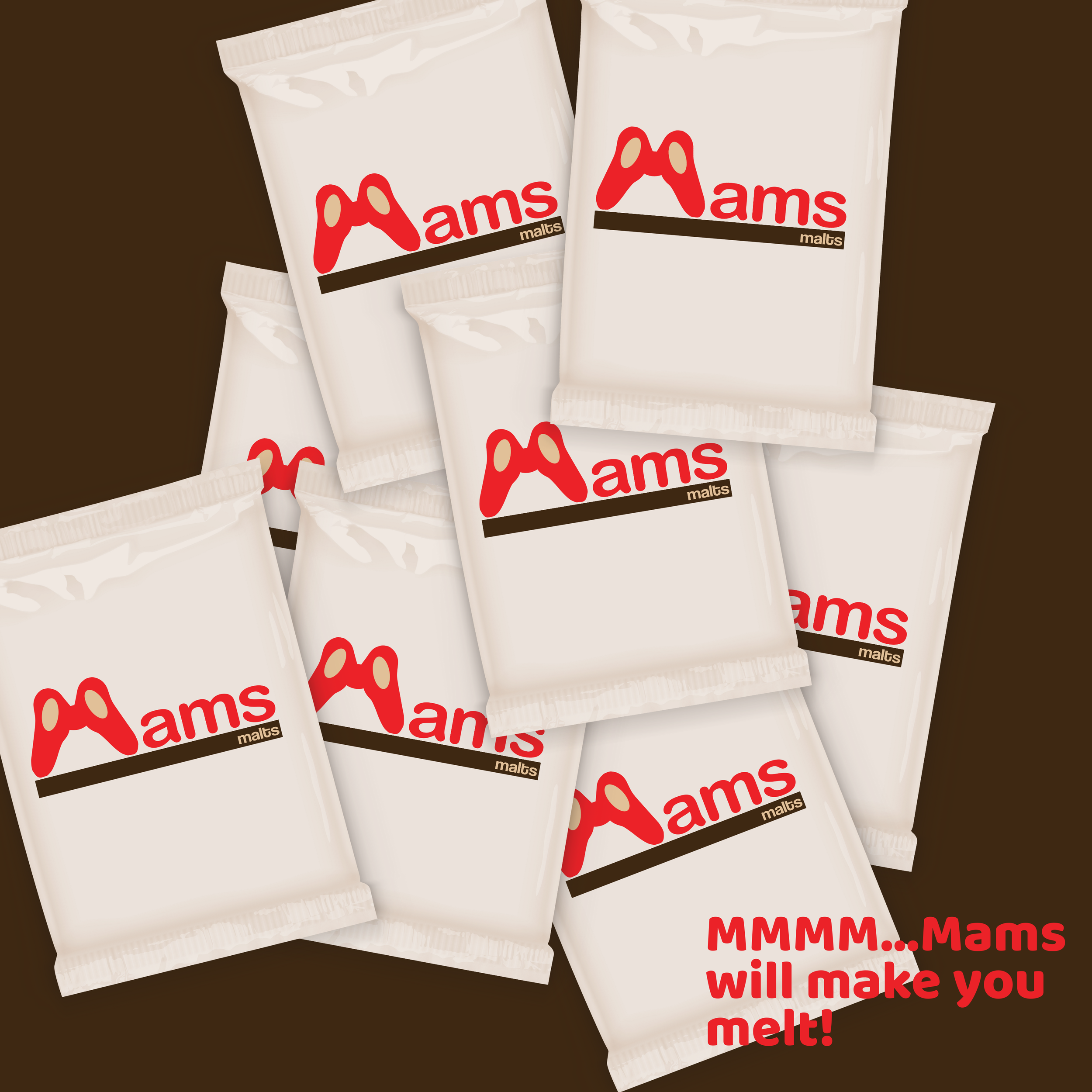
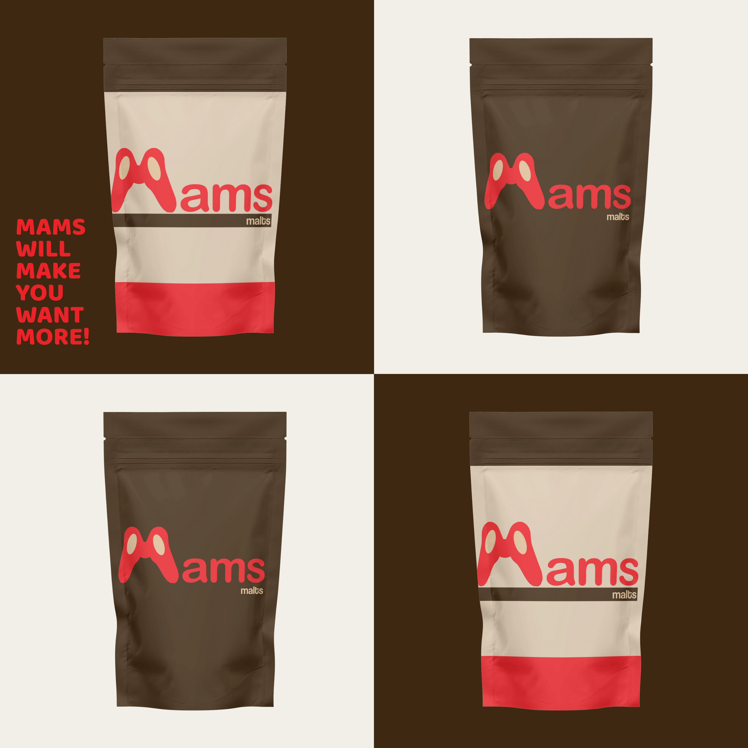
The product packaging for Mams Malts was a chance to explore creative freedom through structure, material, and form.
Inspired by biomimicry, the design mimics organic curves and folds to create a tactile, visually intriguing package that stands out on the shelf. I selected a bold yet playful color palette to support the brand’s tone and carefully constructed a full-scale prototype to bring the packaging concept to life. The layout was intentionally designed to balance both visual appeal and practical function.
berner0387 on Pinterest.com

[ Phase 3 ]
DELIVERABLES
[ Product Packaging ]
albertoobis on Pinterest.com