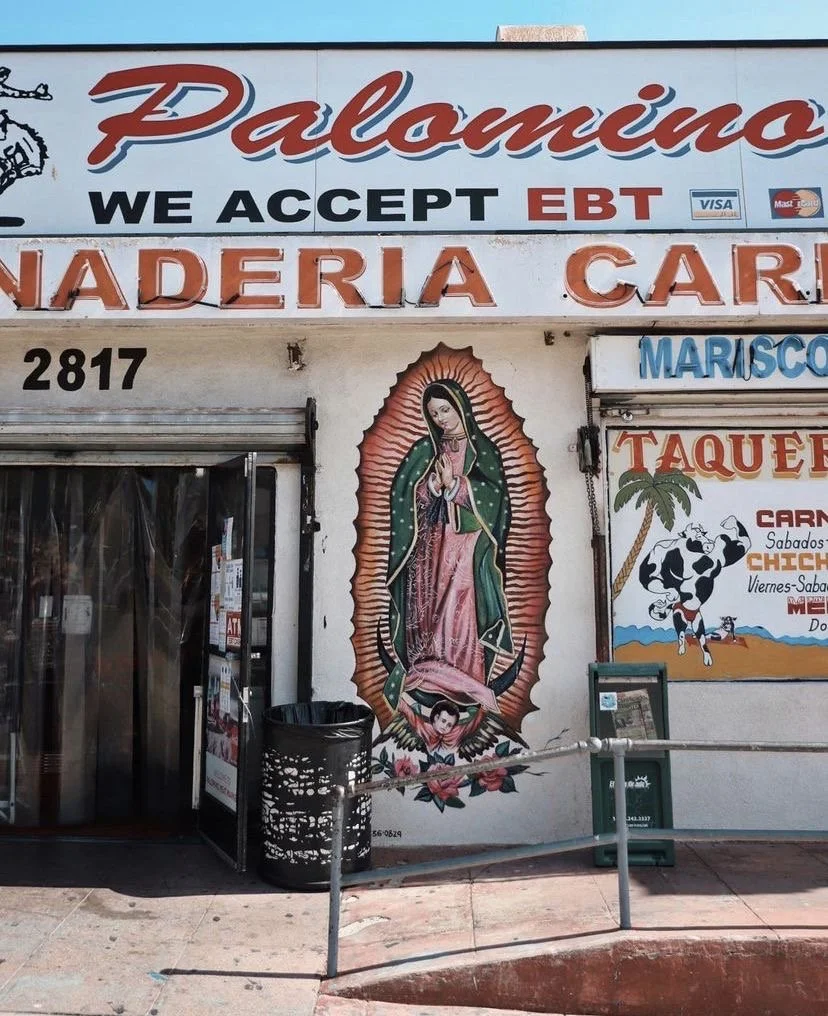
TIRE SHOP
TAQUERÍA
Client work - Logo Redesign

[ original logo for reference ]

[ THE CHALLENGE ]
The infamous parking lot taco business, known for their fresh tortillas and Tijuana-style tacos, wanted a new look. They wanted to maintain their traditional essence, but were looking for a modern twist.
As the graphic designer, I redesigned the logo to have both a traditional and modern essence. One that resonated with both their older and younger generations of loyal customers who connect with the business’ story and food. The primary logo pays homage to their salsa, fresh ingredients and original logo.
[ THE RESULT ]
[ MY ROLE ]
Lead graphic designer
Skills Applied: Brand Identity Design · Logo Creation · Visual Consistency · Typography · Color Theory
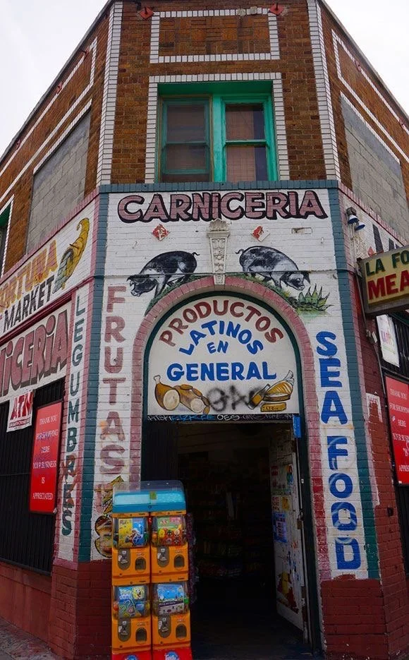
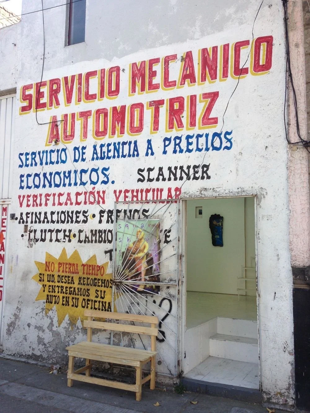
My creative process for this project began with pulling inspiration photos to soak in all the creative elements of my client’s own inspiration. This was an exciting step because I knew exactly what to look for and I resonated with the neighborhoods and storefronts in these photos because they’re part of me as well. These photos helped me determine the color, placement and graphical elements I’d be using in the logo design.
It is hard not to be inspired by bold colors, authentic typography, and the ruggedness and beauty of design in Southeast Los Angeles. Because Tire Shop Taquería’s home location is based in southeast Los Angeles, it was crucial that the new design was inspired by its surrounding character. Inline typography in storefronts is abundant, which means it needed to be in the new logo.
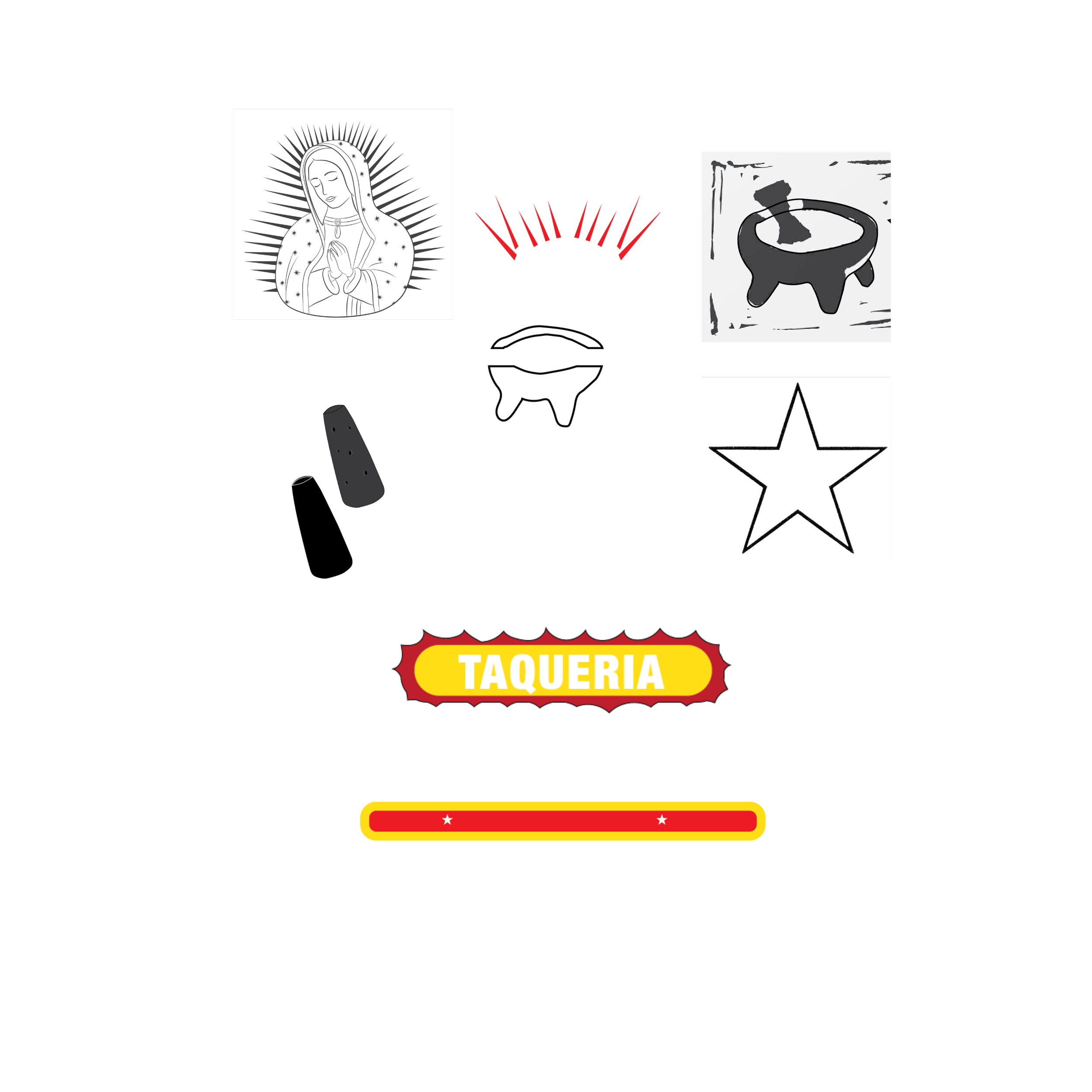
In phase 1, I tried out elements that tied to la Virgen de Guadalupe. From the organic border of “taquería,” to the spikes and the stars — I loved the idea of recreating the culturally significant silhouette in the design. The client and I decided to move away from the silhouette and play with the idea of stars because they were a little more subtle, but still inspired by la Virgen.
In the next phase, I played with a gradient effect to resemble the colors of the business’ fresh salsas, which symbolize freshness and taste. I also removed the round bar beneath “Tire Shop” as it looked a bit busy.
In the final version of the logo, the molcajete motif was made lighter to be more readable, the gradient was changed to the original color palette and there is a slight ode to la Virgen in “Taquería.”


secondary logo
MY CREATIVE PROCESS
( how my brain works)
A challenge I faced when designing this logo was trying not to erase too much personality, history and creativity from the original logo while giving the client what they wanted — a refreshed, more minimal version of the original.
My solution was to decipher what key elements from the original logo I’d want to maintain in the redesign. I researched what the business was known for, what their key ingredients were and how people might feel when eating their food. From there, I drafted motifs that I’d blend with the typeface. I tried a tire motif to go with “Tire Shop” but that wasn’t working. I then tried a molcajete motif, and that won the client and myself over. Because salsas, fresh ingredients, and on-the-spot preparation are what this business is known for, I knew a molcajete motif was the perfect element that would embody personality, history and culture.
SKETCHES
After my research, I began sketching different motifs I wanted to explore. I was inspired by a molcajete, la Virgen de Guadalupe, stars and sharp spikes.
A challenge I faced was choosing a motif that was too obvious and awkwardly placed within the logo. I decided to continue playing with the color and overall design of these motifs. In a later stage of the design process, I went with more minimal odes to my inspiration, like the Virgen de Guadalupe.
THE EVOLUTION